The Evolution of Spring Color Palettes
Spring 2025 is rewriting the pastel playbook.
Over the past few years, pastel tones have slowly made their way back into the spotlight. But this season, they’re getting a fresh update. The new pastels are deeper, warmer, and more emotionally resonant—bringing richness and presence to what was once considered a soft and airy palette.
These elevated hues carry more saturation and soul, offering a sense of grounded comfort that works across a wide range of design styles. Whether you’re thinking about repainting a room, swapping out some textiles, or doing a full-blown home refresh, these pastels bring in just the right mix of whimsy and sophistication.
Ready to give your space a new feel? Let this trend reflect your personality while keeping things light, calm, and deeply inviting.


Color Highlights for Spring 2025
Pastels are the perfect way to play with color—without feeling overwhelmed. Their secret? A shared pale-to-white base that keeps them feeling soft and cohesive, even when you mix multiple hues together. That still holds true in 2025, but the twist is in the base itself: the latest pastel tones are bolder, more vibrant, and full of life. Here are a few standout shades leading the trend:
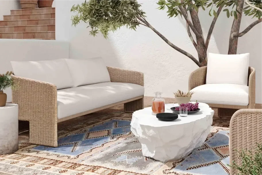
Serene Blues
Blues are taking center stage this spring, evolving into rich, expressive hues that serve as the new neutrals. From soft sky tones to deeper navy blue shades, these colors bring a sense of calm and sophistication to any room. Incorporate serene blues through painted walls, upholstered furniture, or decorative accents.
Buttery Yellow
This golden hue brings sunlight indoors. It’s soft enough to blend easily, yet strong enough to energize a room. Try it on your kitchen walls for a cheerful upgrade or use it as a nursery accent to create a warm, happy glow.
Earthy Coral
Forget bubblegum pink—this coral tone brings warmth and depth to coastal-inspired spaces. It’s ideal for balancing out sea blues and sandy neutrals. Use it in throw pillows, rugs, or wall art for an earthy touch.
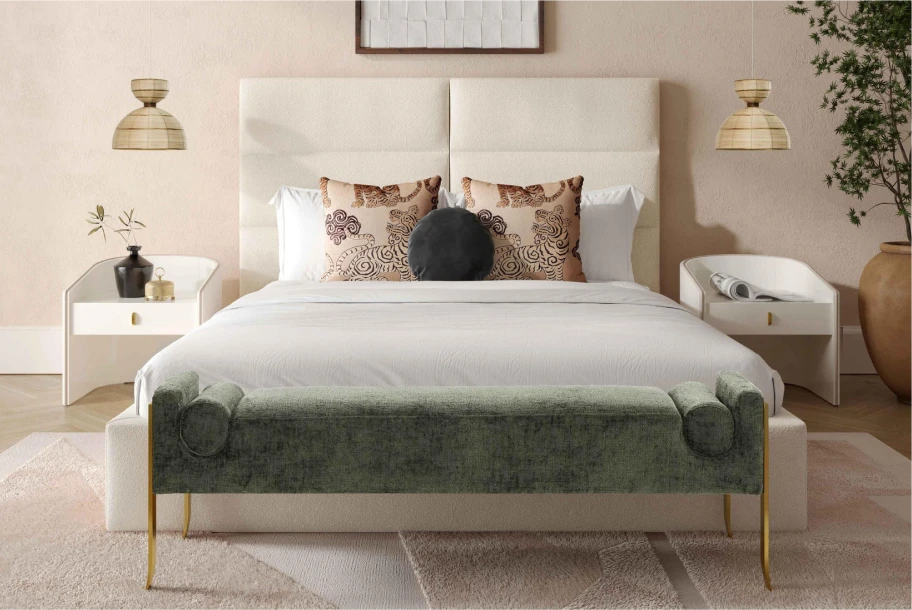
Warm Lavender
A deeper, more grounded take on pale lilac, warm lavender feels calm and comforting. It’s a dreamy choice for bedrooms and bathrooms, offering a tranquil start and end to your day.
These colors work beautifully across materials—paint, upholstery, linens, and beyond. To get started, pick one area you want to refresh, then explore a pastel shade with a slightly deeper tone than you’re used to.
These colors work beautifully across materials—paint, upholstery, linens, and beyond. To get started, pick one area you want to refresh, then explore a pastel shade with a slightly deeper tone than you’re used to.
How to Style These Colors at Home
Pastels aren’t just for accent walls anymore. Spring 2025 design trends embrace the idea of pastels as a central theme. You can go all in and create a pastel-forward space, or simply layer in a few pieces for a soft touch of color.
For Mid Century Modern Fans
A well-placed pastel chair, lamp, or wall art can soften the often stark lines of mid century modern style. It’s the perfect balance of playful and polished.
For Cottage & Country Lovers
Pastel shades of blue, green, and yellow bring fresh charm to classic cottagecore aesthetics. Opt for richer versions of these hues to deepen the warmth and serenity of your space.
For Boho & Shabby Chic Vibes
Bohemian and shabby chic styles already lean into vintage, earthy, and eclectic elements—making them a natural fit for pastels. Update vintage furniture with pastel paints or refresh your botanical art in richer hues.
And remember: even small touches make a big impact. Think throw pillows, blankets, vases, or wall hangings. These pieces are easy to switch out with the seasons and just as easy to love year-round.
Looking to layer your look? Pick a dominant pastel like mint or lavender, then build a palette with different shades of the same color. Or stick to a monochromatic scheme and add soft pastel accents for a minimalist, Scandinavian aesthetic.
Finish with strong contrasts—black lines, brass hardware, or sleek metallics—to keep things from leaning too sweet or saccharine. A dusty pink chair paired with gold legs? Instant vintage-modern charm.
Finish with strong contrasts—black lines, brass hardware, or sleek metallics—to keep things from leaning too sweet or saccharine. A dusty pink chair paired with gold legs? Instant vintage-modern charm.
Pastels with Personality: Why These Colors Work Now
There’s a reason pastels are popping up everywhere: they’re versatile, calming, and endlessly chic.
Bright colors can feel loud and overwhelming. But pastels? They play nicely with everything—from bold patterns to neutral backdrops—making them ideal for both minimalists and maximalists.
If your style leans clean and simple, layer a few pastel pieces over a neutral foundation. Prefer a more expressive look? Go ahead—mix five colors in one room. The soft nature of pastels keeps it cohesive.
Another reason to love this trend? It works year-round. Pastels add lightness in the darker months and breathe freshness into your home during spring and summer.
Ready to refresh your space? Start with a pastel palette that speaks to your mood—and explore the latest styles from top furniture brands at Furniture.com. Whether you’re going bold or staying soft, you’ll find everything you need to bring spring’s most stunning trend home.


Shop Spring 2025 Color Trends
Explore More