1. Consider the Room
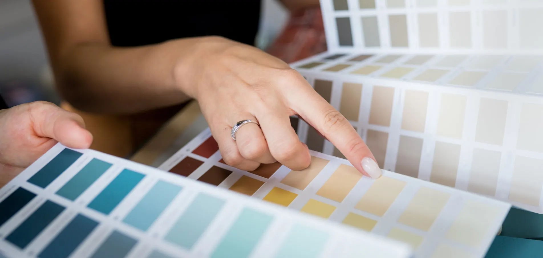
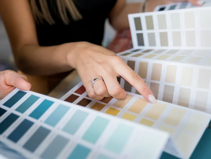
2. Choose Color Tones
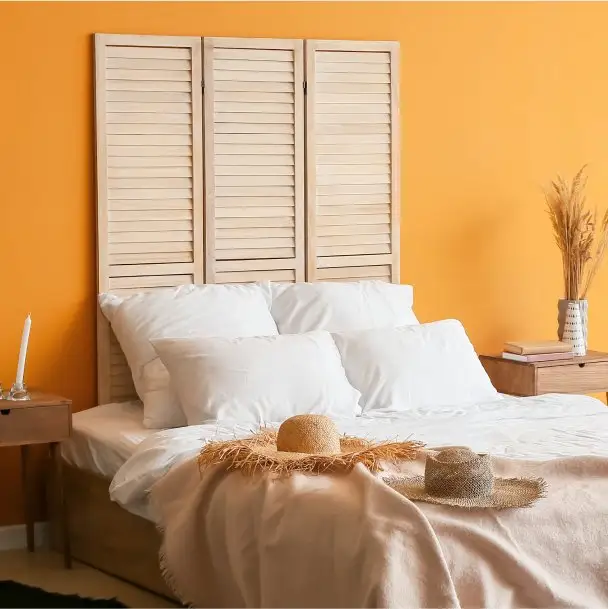
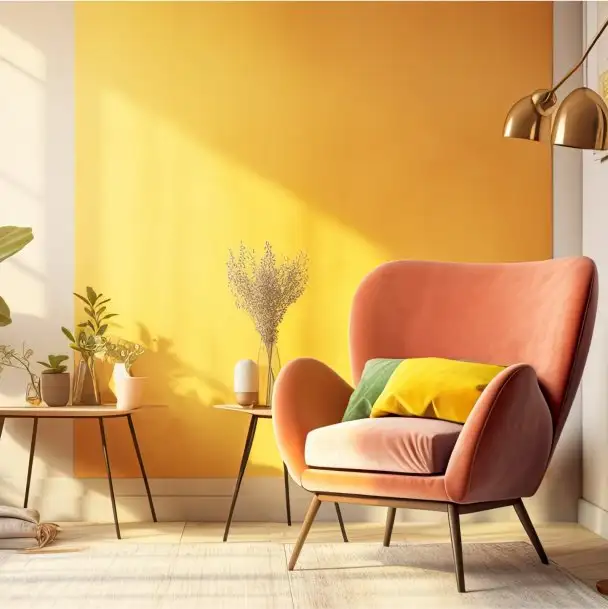
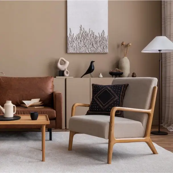
Warm
Oranges, yellows, and reds bring energy to a room. Pair a warm-toned wall with muted furniture tones for a balanced look, or pair muted walls with warm-toned furniture to wrap yourself in a cozy embrace.

Neutral
Grays, beiges, and creams provide a quiet, focused background. Neutral colors are the perfect backdrop for patterned, textured, or bright furnishings or accessories, giving the scene a clean and classy feel.

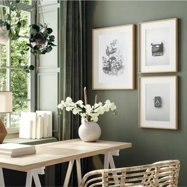
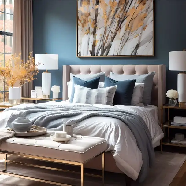
Cool
Greens, blues, and purples are calm, fresh, and outdoorsy colors. Cool colors are great for bedrooms, bathrooms, and spaces where you want a soft and soothing atmosphere.
3. Decide How Many Colors You Want in Your Color Scheme
4. Refer to the 60-30-10 Rule
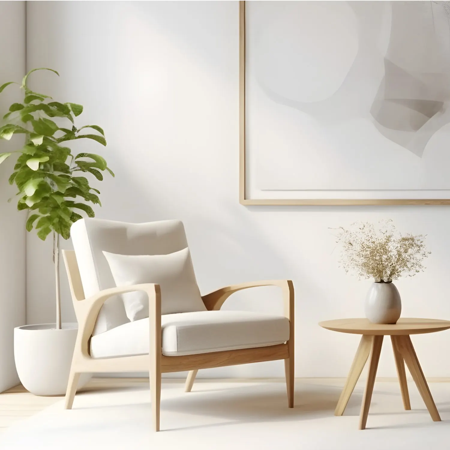
White
White shades include pure white, ivory, and cream. A white room has a refreshing, simple, and invigorating feel. White shades make a room feel light and create a bold statement when paired with darker colors. White is a versatile and timeless choice that pairs with any complementary color.
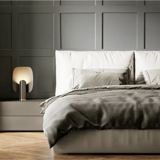
Gray
From a light taupe to a deep charcoal, gray is the perfect neutral. It pairs well with any color and provides an elegant, calming, or bold atmosphere. Gray works well in any space in the house.
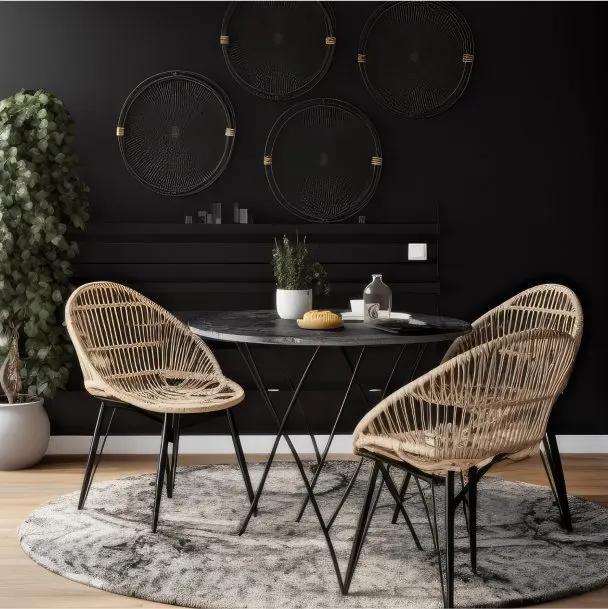
Black
Sleek, timeless, and striking, a black wall acts as a dramatic backdrop for your space, while black pops of furniture give off a sophisticated and elegant look. Black is also a neutral color, so it pairs well with complementary shades. When used correctly, dark tones make any room have a professionally designed look.

Brown
Browns, beiges, and tans offer a more casual, earthy look than a classic black or white. Brown shades have a natural, relaxing, laidback feel and pair well with many complementary colors.
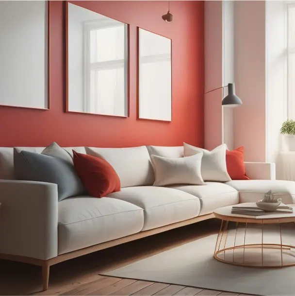
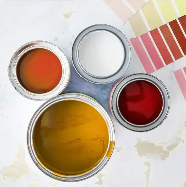
Red
Red is a powerful, bold, and exciting color. Having red in your space makes a room feel energetic and stimulating. However, softer shades of red bring a sense of sophistication and warmth. Red is often used as an accent color when paired with grays and whites to add a strong statement.
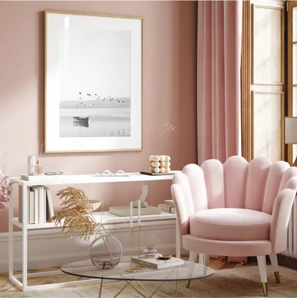
Pink
Though it is a part of the red color family, pink evokes a soft, delicate, and romantic feel. A calming blush is the perfect addition to bedrooms, while strawberry or magenta are great accent colors in living spaces.
Orange
Evoking a sense of vibrancy and refreshment, orange is a balance of warmth and energy that demands attention. From coral to burnt orange, it works well as an accent or secondary color in kitchens and living spaces.
Yellow
A splash of yellow in your home brightens up any day. This vibrant color evokes a sense of happiness and optimism. Whether a soft, gentle shade or a statement gold, yellow complements reds, oranges, blues, neutrals, and more.
Green
Symbolic of nature, green is a grounding, earthy color that adds a sense of calm and relaxation. From a subtle sage to a lively burst of olive, green hues work well with various colors in any space.
Blue
From a bright blue or turquoise to a royal or midnight blue, shades of blue include a broad range of hues that boost relaxation, style, and class. Add some energy into living spaces with an eccentric blue or soften the tones for a soothing space.
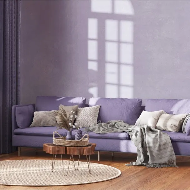
Purple
Associated with royalty and luxury, purple has a bold personality and distinguishes a room. Soften the hue with delicate lavender and lilac, or add richness with deep plum and indigo.
Neutrals
Neutrals, such as beiges or grays, work well as dominant colors. They lay a solid base for secondary and accent colors to pop. Secondary colors look great on large furniture pieces, rugs, or drapes. Accent colors should be the brightest in your palette, but use them sparingly, such as with wall art or accent pillows.
