Explore More
DESIGN 101
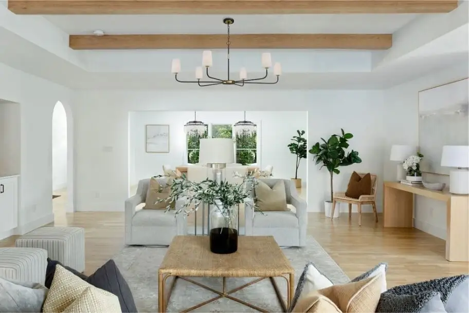
Chandelier Size Guide
Learn how to choose a chandelier size that fits in perfectly with the rest of your home.
FEATURED
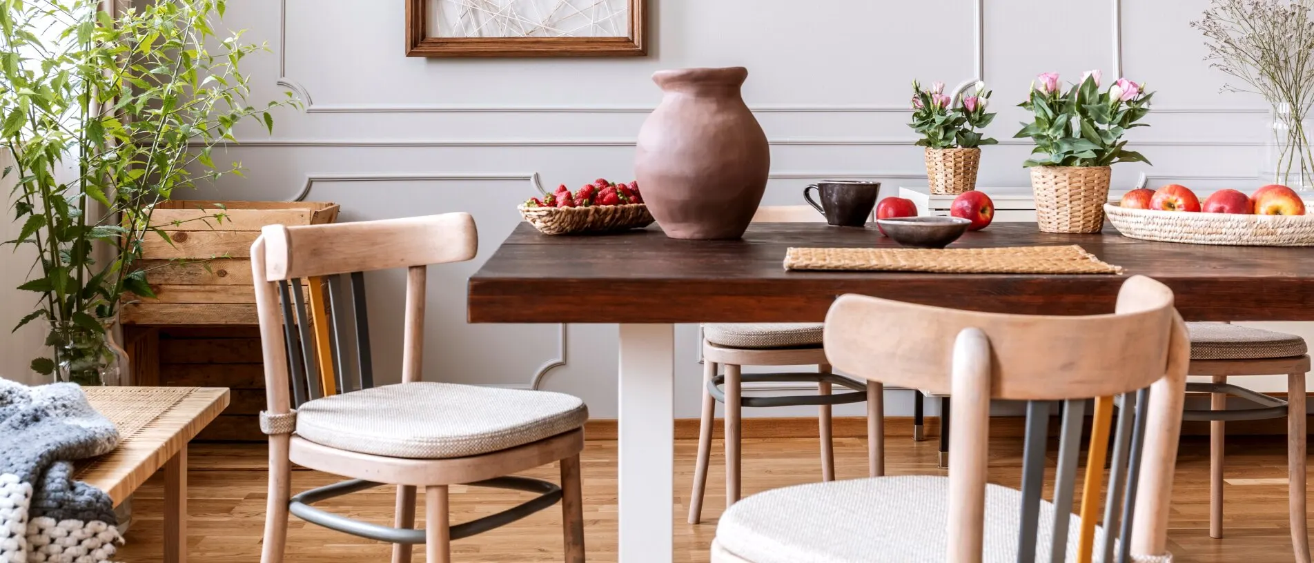
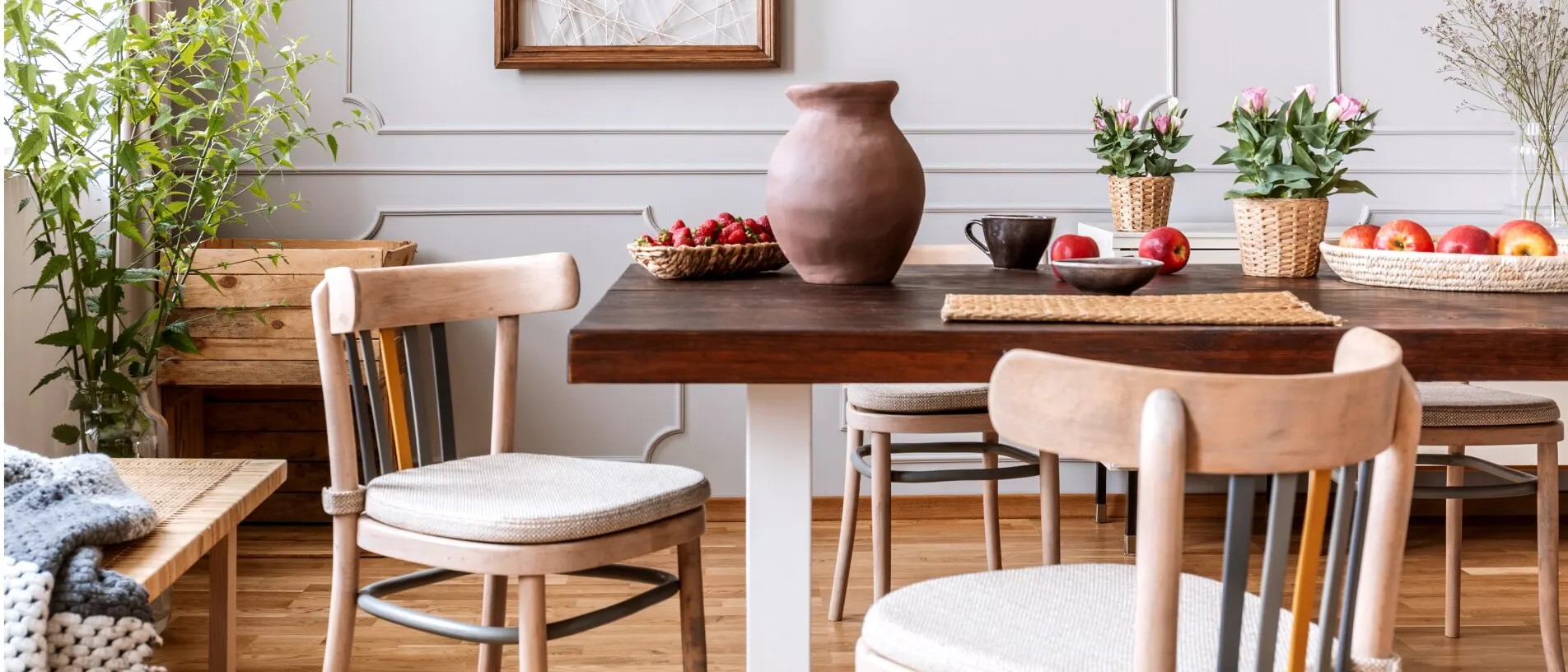
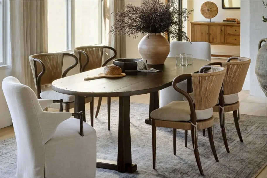
Fall Dining Room Ideas
Celebrate natural beauty with One Kings Lane’s modern dining collection.
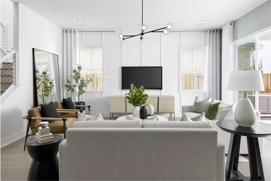
Find the Right Lighting
Learn how to find the right chandelier, pendant or lamp to enhance any room
© 2026 furniture.com. All rights reserved